
شرح عمل التصميم
Step 1
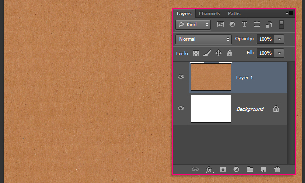
Create a new 1600 x 1067px document, then place the “Cardboard Brown Paper Texture” image on top of the Background layer. You can rotate it and resize it as needed.
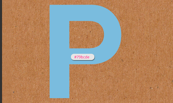
Create the first letter of the text using the font “Coolvetica”, and a font size around 590pt. Then, choose a bright color for the letter. Here, a bright blue is used (#79bcde).
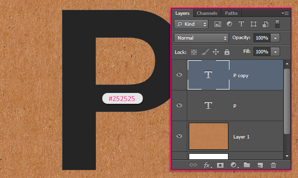
Duplicate the text layer and change the copy’s color to #252525.
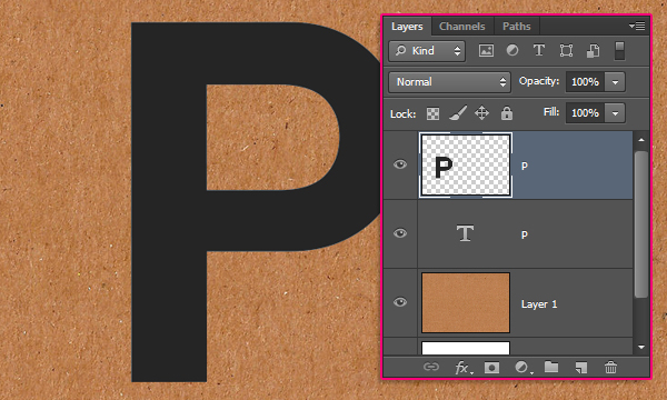
Right click the copy text layer and choose “Rasterize Type”.
Step 2
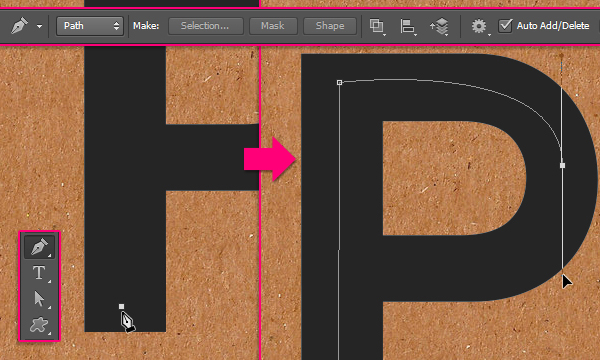
Pick the Pen Tool and choose Path in the Options bar. What we’ll do next, is create a path in the middle of the letter.
You’ll need to click once to add an anchor point (a sharp corner), and click and drag to create a curve.
Don’t close the path, and add the last anchor point so that it doesn’t intersect with any part of the path, and is a bit distant from it. Don’t worry about making the work path perfect, as we’ll modify it next.
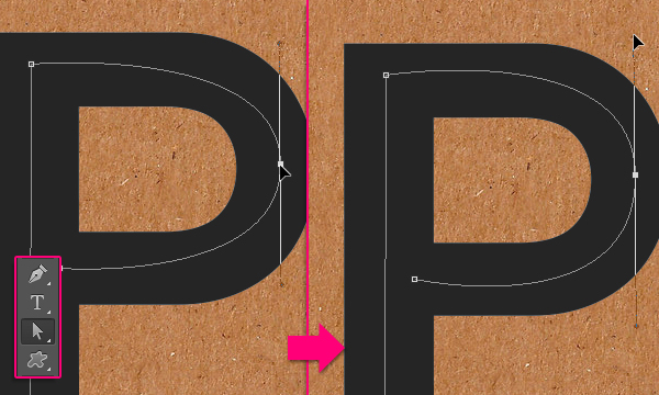
Pick the Direct Selection Tool, then click the anchor points to move them around, or you can click the Direction Points at the end of the two Direction Handles, then move them around to change the orientation of the curve, or drag them outwards and inwards to make the curve wider or narrower.
Step 3
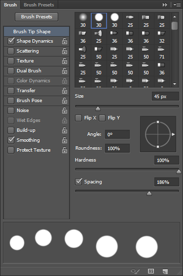
Pick the Eraser Tool and open the Brush panel (Window -> Brush). Under Brush Tip Shape, choose a hard round brush, set its Size to 45px, and set the Spacing to 186%.
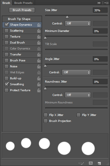
Under Shape Dynamics, change the Size Jitter to 35%.
Step 4
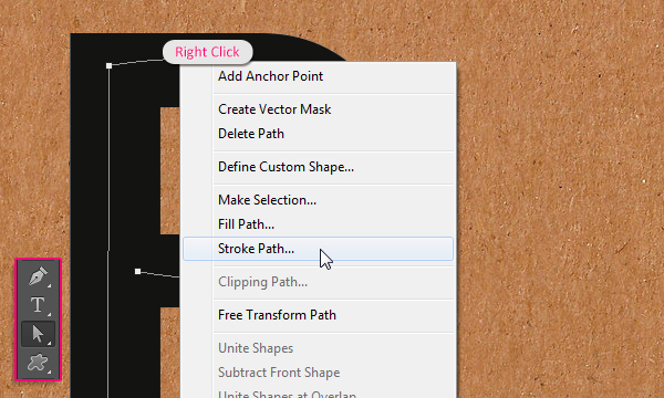
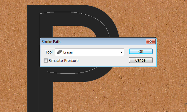
Pick the Direct Selection Tool once again, then right click the work path and choose Stroke Path.
Choose Eraser from the Tool drop down menu, and make sure that the Simulate Pressure box is un-checked.
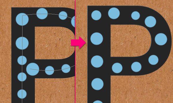
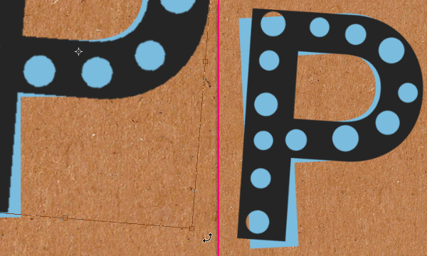
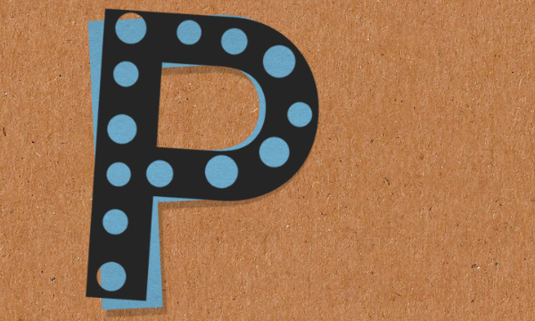
This will erase different sized dots from the rasterized text layer. If you don’t like how the dots look, you can undo, then stroke the path again, or maybe change the brush size if needed, until you like the result. When you do, hit the Enter/Return key to get rid of the work path.
Go to Edit -> Transform -> Rotate, then rotate the rasterized layer slightly. Hit Enter/Return to accept the changes. You can then rotate the original text layer as well.
Step 5
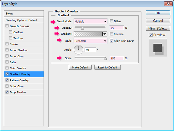
Double click the original text layer to apply the following Layer Style:
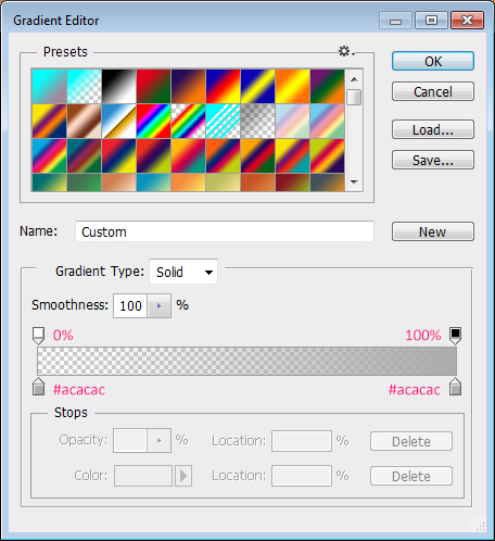
Gradient Overlay: Change the Blend Mode to Multiply, the Opacity to 25, the Style to Reflected, and the Scale to 150%. Then click the Gradient box to create the gradient.
The gradient is a simple transparent to fill color one. To the left side, set the color to #acacac and the Opacity to 0%, then, in the right side, set the color to #acacac, and the Opacity to 100%.
(You’ll need to click the stops above and below the gradient bar, then assign the values in the corresponding fields at the bottom).
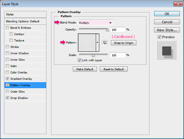
Pattern Overlay: Change the Blend Mode to Multiply and choose the “Cardboard” pattern.
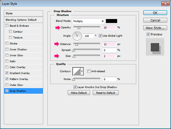
Drop Shadow: Change the Opacity to 20, the Distance to 12, and the Size to 2.
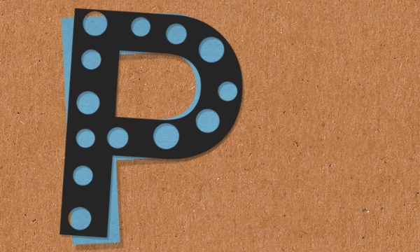
This will give the text a subtle 3D effect.
Step 6
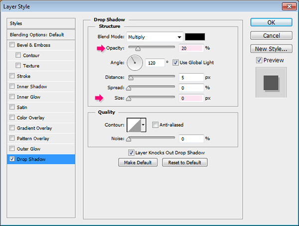
Double click the rasterized text layer to apply a simple Drop Shadow effect, by changing the Opacity to 20 and the Size to 0.
This will style the top dark layer.
Step 7
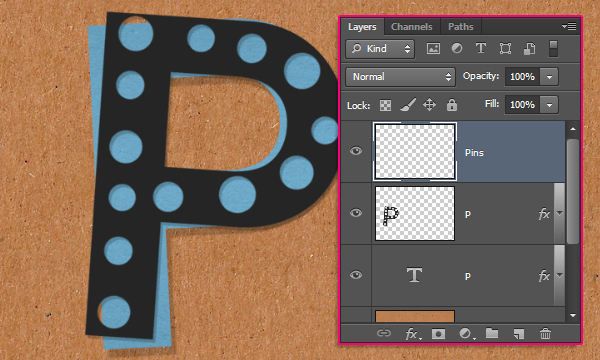
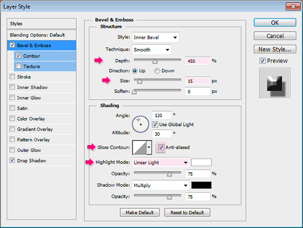
Create a new layer on top of all layers and call it “Pins”.
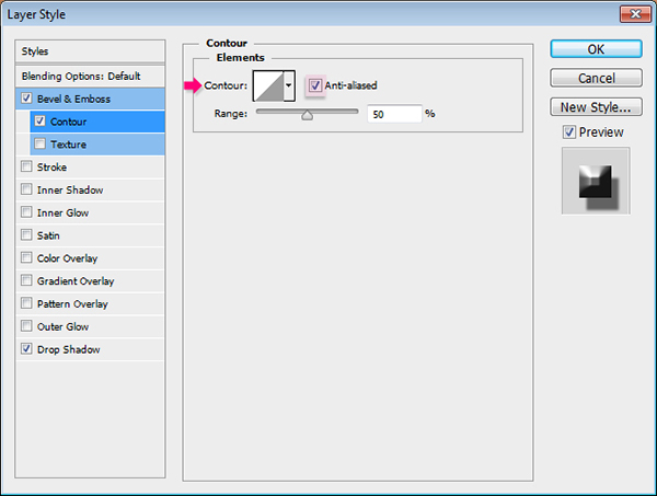
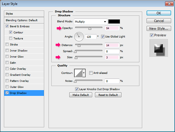
Double click it to apply the following Layer Style:
Bevel and Emboss: Change the Depth to 450, the Size to 15, check the Anti-aliased box, and change the Highlight Mode to Linear Light.
Contour: Just check the Anti-aliased box.
Drop Shadow: Change the Opacity to 54, the Distance to 14, and the Size to 3.
Step 8
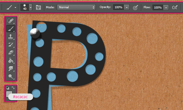
Pick the Brush Tool, choose a hard round brush, set its Size to a value around 40px (depending on how big or small you want your pins to be), and set the Foreground color to #acacac. Then click once to add a pin on top of the letter you have.
Now, you’ll need to repeat the same steps to create the rest of the letters. The color values used here are (Pink #ff8e94, Green #82ca89, Orange #ff933c, and Purple #8560a8).
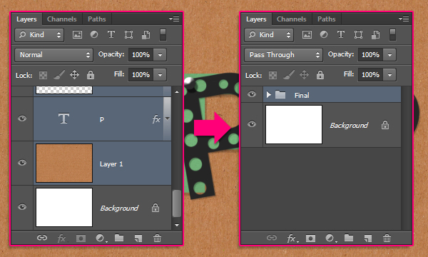
When you’re done, group all the layers (except for the Background layer), by selecting all of them (Click the layer at the top, then Shift + click the layer at the bottom), then go to Layer -> Group Layers.
Duplicate the group, then go to Layer -> Merge Group.
Step 9
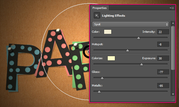
Go to Filter -> Render -> Lighting Effects. Choose the Spot light, and set the Color to # f3edd3, the Intensity to 22, the Hotspot to -8, the Colorize to #fffec6, the Exposure to 30, the Gloss to -77, and the Metallic to -85.
Then, click and drag the white circle to change its size, or click and drag in any empty area to change its position, until you get a result similar to the one below.
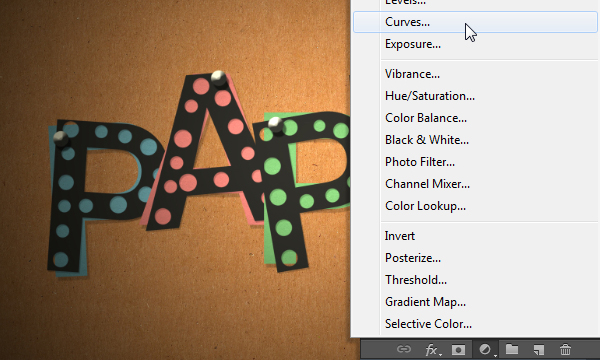
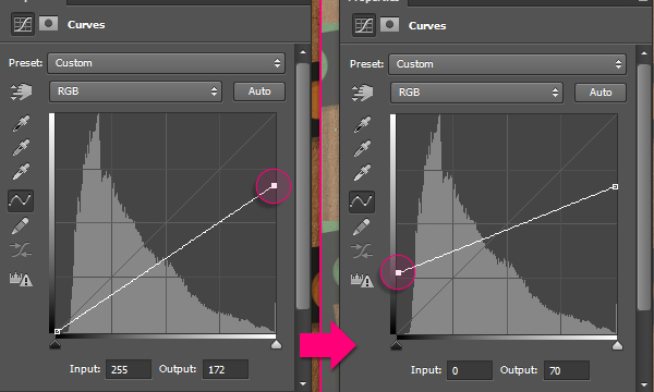
Click the “Create new fill or adjustment layer” icon down the Layers panel and choose Curves.
Select the points and change their Input and Output values as shown below.
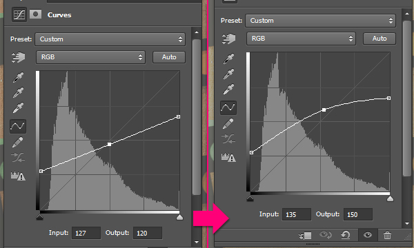
Click to add a point in the middle, then change its Input and Output values as shown below as well.
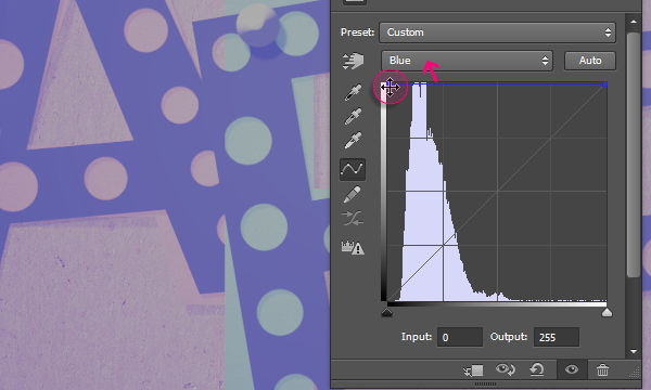
Now choose the Blue channel from the drop down menu at the top, and drag both points upwards.
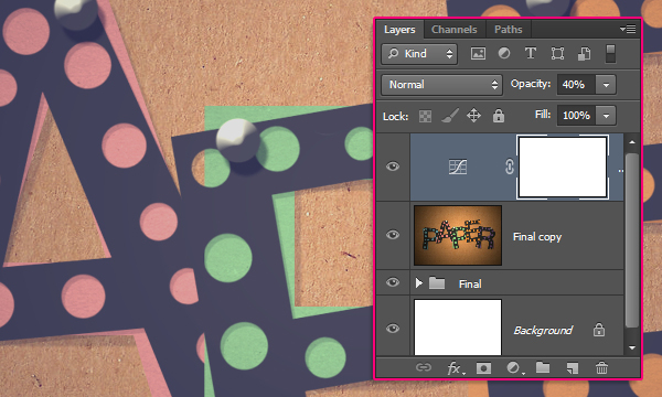
Change the Curves adjustment layer’s Opacity to 40%.
Step 10
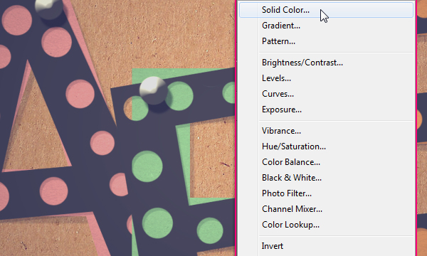
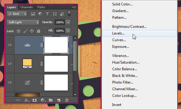
Click the “Create new fill or adjustment layer” icon once again and choose Solid Color.
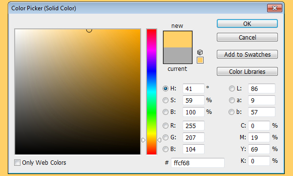
Set the color to #ffcf68.
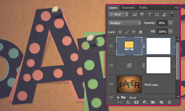
Change the Solid Color layer’s Blend Mode to Multiply and its Opacity to 30%.
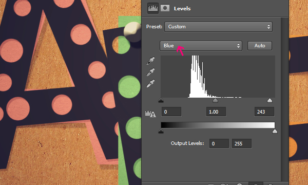
Click the “Create new fill or adjustment layer” icon one last time, and choose Levels, then change its layer’s Blend Mode to Soft Light.
Pick the Blue channel from the drop down menu, and change the Highlights value to 243.
And you’re done!
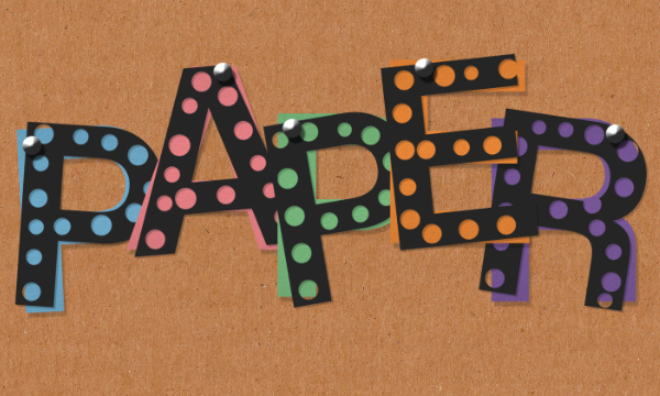
Conclusion
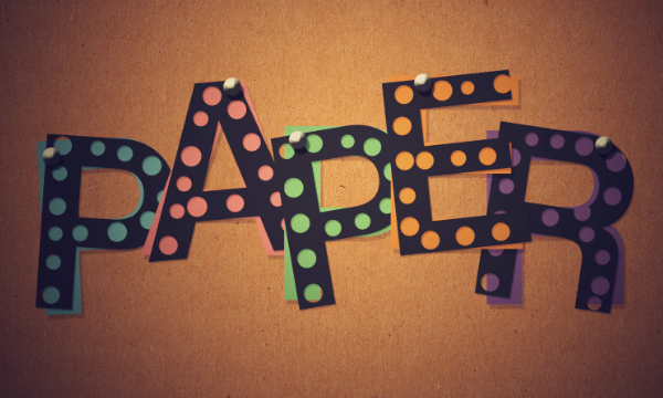
This is the final result. A very simple, but quite useful, technique of using the Pen Tool to create work paths, then stroke them with the Eraser Tool instead of the Brush Tool.
Hope you enjoyed the tutorial and found it helpful.


 منذ /06-07-2013, 07:18 PM


 المواضيع المتشابهه


 العرض المتطور
